Saturday, 19 November 2011

Macro Love

Easy to while away the time, photography flowers and insects on macro. Photos taken yesterday in the back garden.


Have a wonderful weekend!

Wednesday, 9 November 2011

Saturday, 22 October 2011

Meet Jess aka PJ (Princess Jessica)

It started a couple of months ago. “Mum come and look at this” had me looking at yet another web page photo, one of the girls had found, of some poor sad looking dog who was in foster care and desperately needed a home. They wanted another dog and used every ploy. It worked. ;-)

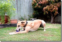
We are now the official proud owners of Jess an ex racing greyhound. Jess had been in foster care for a couple of months after some critical dental work to remove diseased teeth. (Racing dogs have glucose smeared onto their teeth before races apparently). We adopted her from a wonderful organisation called Friends of the Hound. I highly recommend them. They are totally professional, well organised and have the welfare of the dogs as number 1 concern.

Jess is nearly 8 and has settled in well. She was a little thin when she came to us and we have worked on fattening her up. A diet of puppy food, organic eggs and meat and tinned sardines for the last 3 weeks and she is now 1kg heavier. This is a dog who does not mind being cuddled and kissed 24/7, perfect for us and for her. A match definitely made in heaven. Isn’t she gorgeous!

DSC_4432DSC_4435DSC_4446DSC_4447


Here are a couple of layouts, the first of many.


Have a wonderful weekend everyone!

Monday, 17 October 2011

Beach Sunrise

Photos taken yesterday morning watching the sunrise at Bribie Island.


Beautiful shades of peach and grey/blue.

Saturday, 8 October 2011

Watercolour Painting with Paintshop Pro

For those who commented on my "painting" in the forum earlier this week, I have put together the steps I took to achieve the effect. It uses a combination of techniques from Photoshop tutorials adapted for PSP.

 Here is the original image that I was working from. I took this photo in Rajasthan, India in 2006.


Method
  1. 1.       Duplicate your image and blur. (Adjust/Blur/Gaussian Blur of radius 3)
    2.       Duplicate this layer and apply Artistic Effect/ Glowing Edges. (I used default 3.20)
    3.       Invert this layer. (Image/Negative Image)
    4.       Convert glowing lines to greyscale and desaturate to approximately 40%.
    5.       Duplicate the layer from step 1 and drag this layer to the top. Invert this layer (as in 3) and set the blending mode to Dodge. The image will be mostly white and this will be the base to paint (i.e. reveal the image with colour below).
    6.       Now comes the fun part. Using a variety of brushes with colour set to black and opacity at no more than 40% you start painting the brush strokes. As you are working on a dodge layer, the effect of this will be to reveal the underlying colours of the photo. Use a variety of brushes (I used dry brush and van gogh). You can build up colour by going over areas more than once. It is better to work with larger brush strokes and move down to smaller to fill in detail.
    7.       Lastly you can merge the layers and add a subtle texture effect eg. Canvas fine.

    Vary the parameters to achieve different effects. 
    Here is another one that took just 5 minutes. Al Hajjar in Yemen.


Thursday, 29 September 2011

Playing with Textures

Jerry of  Shadowhouse Creations provided 2 raised effect textures on his blog and I could not resist playing with them. I love adding texture to photos! This is the result. The photo was taken many years ago when travelling in the Northern Areas of Pakistan. I remember stopping late afternoon for a meal in a local inn. This is the first time that a foreigner had ever stopped to eat there. We had a plate of mutton and rice. It was good! The tea was served, as is typical in this area,  green with cardomon and cinnamon. This area is the most beautiful on earth. Three mountain ranges collide to provide scenery that takes your breath away.


Click on photo for texture detail and credits.
To achieve this effect I used the first texture with following layers:

1. Lightened texture and placed as Overlay 100%.
2. Original texture Colour Burn 31%
3. Original Photo

Jerry has a great collection of free textures available. They are definitely worth checking out.

Friday, 23 September 2011

Years at the Spring..

Well it was until this week as we now have a foretaste of the heat of Summer. The girls and I took avantage of the earlier milder spring weather to really put some effort into our long neglected garden. Nothing like garden therapy to lift your spirits. We now have 3/4 of the back yard gardens complete and even Harry is enjoying exploring now that the jungle of weeds has been cleared. My vegetable garden for Summer is starting. Coriander which had been flowering for weeks, has been cleared and I have planted cucumber, egg plant, beans, squash, chillies, tomatoes, kale and herbs. I'll see how they go before adding some more.


There are no distinct seasons here and you have to look very closely to find the presence of Spring. It is there just hidden....


Mulberries are the first fruit to ripen. There is always enough on the tree for the birds and ourselves. The Koel birds are late this year in their migration. At this time of the year we usually have a pair take up residence in this tree.


 I love the soft green of new leaves. We have pruned trees heavily for the first time in years so watching new leaves emerge from hard old wood is wonderful.


Our garden is full of the perfume of citrus. Intoxicating!


This is the first year I have tried growing sweet peas. They have thrived growing with the coriander.


 Here are a couple of layouts from the photos:


Have a wonderful weekend.

Tuesday, 13 September 2011

Monday, 12 September 2011

10 things you may not know about me

Thanks Esther for tagging me. I've been sitting on this for a few days not knowing what to write so here is what I have come up with:

1. I was born in Malaysia to Australian parents and have always loved being able to write this as my place of birth on forms etc. It always seemed so exotic to me as a child.

2. I have been reading continuously since around the age of 5. I usually have 2 books on the go and although we try to live as "green" as possible, this is one area I cannot compromise. A kindle? Never! I just love everything about a printed book from the artwork, typeface and even the smell. I collect antique books.

3. My heritage is basically Scottish with a little English and one Norwegian sailor who jumped ship just after the Crimean war. Looking into our family history has been interesting.

4. I love spicy food and especially Thai.

5. I graduated with degrees in Chinese and Economics but majoring in Maths and Computer Science (as it was called at that time).

6. Growing up, I always wanted to be a Geologist but when finishing high school, changed my mind at the last minute and ended up after University in Banking then China trade. No regrets or not too many....

7. I am a qualified Gemmologist and love studying gemstone inclusions under the microscope. So easy to immerse onself in the magic of 80x.

8. I love mountains and especially the Karakorums. They are new, rugged and totally untamed.

9. Camels are my favourite animals. They are independent and have a mind of their own.

10. I lived in Asia (China, Taiwan and Hongkong)  for many years.

Now my turn to tag and I am selecting Carin and Tracy fellow team members of Studio Ztampf!

Thanks and have a great week.


Here are some of my camels:


Credits here.

Tuesday, 23 August 2011

Sound

Fhung of Studio Ztampf has just released a wonderful paper pack called "Sound". The graphics on the pages remind me of Leonardo da Vinci sketches. I love them!


I have been wanting to do a simple page for my All About Me album of my current playlist so started with this.


I bought my first ipod, a little green ipod shuffle, last year when sick in bed. It kept me up to date with news and at that stage was mostly full of podcasts. The girls used to joke that I must have been the only person who didn't have music on their ipod. Which wasn't exactly true as it did contain a few of my favourite symphonies. I remember listening to Mahlers 5th Symphony just a few hours after coming out of the anaesthetic in hospital. A great choice. Mahler was a total Drama Queen so any of my moans at that time were pale in comparison.

The shuffle has now progressed and contains lectures from the Teaching Company. I love the music lectures and shop when they are on special, juggling between buying direct from the US or from Australia. It all depends on exchange rate that day.

Shostakovich is a composer that I have only discovered in the last few months. In the past the snippets of his music that I heard seemed just noise with no purpose or theme. His Cello Concerto No. 1 was then covered in a 45 minute lecture on History of Concertos and I was hooked. I could not believe that after listening primarily to classical music for more than 40 years, I had not discovered his genius. It was as if you are standing in darkness in a room and all of a sudden the light is turned on and you find you are standing in a gallery of magnificent pieces of art.

There is such joy in discovery.

Have a wonderful week.

Friday, 19 August 2011

Recent layouts

When times get difficult, I always find that it helps to escape and look back through travel photos which is what I have been doing recently. Mum and Dad, you will certainly recognize some of these places.


Have a great weekend everyone.

Credit details can be found in the following galleries:
Designer Digitals
MScraps

Thursday, 16 June 2011

Chat tomorrow with Fhung of Studio Ztampf!


This is a great opportunity to get to know Fhung!

Monday, 11 April 2011

Friday, 8 April 2011

Friday, 18 March 2011

Myanmar Album

I have been sitting on around 4,000 photos from our trip to Myanmar in November/December 2009 wondering how to scrap them for an album. We all absolutely love the India album I had made earlier and this was the problem. Set a precident and then there are fixed ideas of what the travel album should look like. For the Indian album, I had a theme for each location which really worked well and Sonia thought this should also be done for Myanmar. I did not want to restrict myself to one or two colours for each location and was favouring a more eclectic album with each double page different. ( ie I had no idea what to do...) Amber was happy with whatever was decided ie the teenage "whatever" which can be wonderful at times but not this time.


I have scrapped some of the photos in layouts but just wasn't inspired to follow through with that style for an entire album. Then along came a free template from Katie Pertiet at Designer Digitals last Saturday and suddenly inspiration. I knew what I wanted to do. Photos large and bordering pages with overlayed small pics with white borders. A strip across page for journalling. And that is it. I might add some elements but probably not. Lynn Grieveson has some wonderful double page templates that I can use/modify so now I am set and oh so inspired.

So here is the first double page. What do you think?


Now I am set to start working on the album. And just in time as we are heading out for a quick holiday in a month. Here we are waiting in anticipation:
Click on photos for details of kits used.

Wednesday, 16 March 2011

Pages with no Photos

For someone who loves photos and for the most part a page begins and ends with a photo, the challenge to create pages without a photo has been interesting. Yes it can be done!


Just 2 of my loves - the garden and patterned papers.

Have a great week everyone.

Thursday, 10 March 2011

Saturday, 12 February 2011

Valentine Day Sale at Studio Ztampf!


Holiday and valentine products are on sale at Studio Ztampf! 

Subscribers to Ztampfever will get an extra 20% OFF coupon to be used toward the sale items or anything else in her shop. This is a great chance to purchase the crafty calendars at a discounted price.

Become a Facebook Fan of Ztampf! to get the wonderful kit Socialite for free. This is a layout I put together with the kit.


 Have a wonderful weekend everyone!

Thursday, 3 February 2011

Welcoming Year of the Rabbit

Today is the start of a New Year for the Chinese Calendar. Goodbye year of the tiger and welcome year of the rabbit. The general concensus is that this will be a year of rest and peace after last year.


We celebrated today with a meal cooked together. I love home cooked chinese meals, which taste so different to restaurant food. The only issue is the preparation time which for us was a few hours. The food however was wonderful.


For this layout I used the newly released "Year of the Rabbit" by Studio Fhung.

Happy New Year!

Monday, 31 January 2011

January Roundup

I have just completed uploading my 11 pages of photos for January to Inkubook, where my year book will be printed. It is so exciting to see it all formated and in book format on the screen. Using templates with no embellishing and mostly graphic format has been a lifesaver and has simplified the task no end. I have included a lot of journalling including current affairs, weather and also a calendar of what we have done on a day to day basis. Sounds complicated but it is simple as I am journalling whatever interests me at the time.

This works out much better for me than photo a day with a week of photos to a page. I started out well in 2010 but when we had week after week at doctors and major medical problems, I really did not want to look back on so many of my weeks. Some things are better ignored. This year, I am scrapping months and I am aiming for anything from 3 to 10 pages of photos a month.

To give an outline of January:

Page 1: Contains a page of photos taken on 1/1/1. I will also do this randomly throughout the year for special days.

Pages 2-5 were photos from our visit to see my parents.
(These pages were posted earlier)

Pages 6 and 7 are photos taken over the month with a world news/current affairs summary. (We are news junkies here!)


Page 8: Photos with random summaries of the month including weather etc.
Page 9: Photos and journalling about my garden. (Yes there is a lot of journalling this month but it is Summer and I am planting seeds.)


Page 10: To keep me inspired with Photo a day, I am selecting a different topic each month as a focus. For January this was flowers and these photos are all cropped onto the page. 
Page 11: Our monthly calendar.


To try and tie the individual months together somewhat, I will be using a different colour theme for each month and selecting one coordinating paper. That is it. No embellishments or elements. Not a staple or stitch in sight! 

Now lets see if I am as enthusiastic at the end of February or for that matter later in the year.


And if anyone is interested, the templates that I am using/modifying are from Biograffiti at Oscraps.

Have a great week everyone!