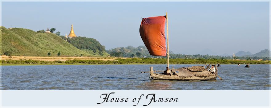
I have scrapped some of the photos in layouts but just wasn't inspired to follow through with that style for an entire album. Then along came a free template from Katie Pertiet at Designer Digitals last Saturday and suddenly inspiration. I knew what I wanted to do. Photos large and bordering pages with overlayed small pics with white borders. A strip across page for journalling. And that is it. I might add some elements but probably not. Lynn Grieveson has some wonderful double page templates that I can use/modify so now I am set and oh so inspired.
So here is the first double page. What do you think?
Now I am set to start working on the album. And just in time as we are heading out for a quick holiday in a month. Here we are waiting in anticipation:
Click on photos for details of kits used.


4 comments:
Your Myanmar designs let the photos shine! I love the idea. And you can play around with the sizes, orientation and number of smaller photos and still keep the theme working.
As for your forthcoming trip... I don't recall anyone scrapping about a holiday BEFORE they went! lol!! Sounds like a fabulous getaway.
LOVE the choice you made here!!
You can have so much variation while still keeping the general idea.
And your next trip, all I can say is that you will LOVE Bali. I went there in 2006 and still have very fond memories.
Gorgeous! Simple design works best when you want to scrap a LOT of photos :). Minimal embellishments, focus on the photos and the journaling. That's what I did with my 40th Bday Album: http://ztampf.com/ztampfest/v/Ztampf_CT/Fhung/?g2_page=3
Good luck finishing your album, Carolyn - I know it will be fabulous :)
I love the way you are doing this. It really lets the photos shine!
Post a Comment